The Marquee tag does not work with many browsers these days and I have tried multiple time to find out how to code the following simple html text using CSS without any luck. I just do not have the programming chops nor can I find and online editor to do it for me.
[marq=left]<img src="images/smiles/006.gif" width="25" height="29"> [size=18]Unable to view videos - Try a different browser[/size] <img src="images/smiles/006.gif" width="25" height="29"> [size=18]Unable to download files - Try a different browser[/size] <img src="images/smiles/006.gif" width="25" height="29">[/marq]
Just hoping that one of our web gurus has an idea for me on how to fix it with current website compliant coding. I am aware that my meager coding attempt is a mix of html and BB code.
There are going to be two problems I hope to have solved. This is the first one which had to do with the marquee/scroll feature which we attempted to resolve but it did not work in a manner that was satisfactory to the conditions that exist.
The two images below shows how the current marquee feature limits the text, image, link, whatever, that is between the marquee tags to the confines of the Welcome to M4T block.
The problem that I ran into in using the Chat GPT code above is that it allows the text to scroll across the entire page instead of remaining within the borders of the Welcome to M4T block as shown in the images above.
Problem 2:
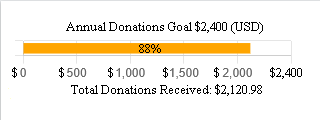
I would like to have a 13 month line chart and bar graph combined into a single entity.
The line graph portion will run from $0.00 to $2,400.00 spread across all 13 months.
The line can be black and never change or it could be black or red until the $2400.00 dollar goal is met and then it could turn to green.
The bar graph portion will also be 13 months
Month #1 has no goal amount since the amount shown in this column is carryover from the 2023/2024 donation drive.
The amount of $633.31 which is carryover from the 2023/2024 funds drive is included in the $2400.00 line chart total.
Month # 13 is May 2025
Monthly goal for months 2 to 13 is $200.00
Below $200.00 goal the bar should be shown using the color Red.
Above $200.00 goal the bar should be shown using the color Green.
What I want is something I can update the figures on a monthly basis and the graph will update with the figures I input. As it is now their are 3 totals for the 2024/2025 Donations drive.
Carryover amount: $633.31 - Total $633.31
May amount: $111.10 - Below goal $88.90 - Total $744.41
June amount: $89.84 - Below goal $110.16 - Total $834.25
W3Cschool is great. What you’re doing here is beyond the scope of HTML. You’re deep in scripting teritory. To make life easier they suggested to use the chart.js library. By this they created what is called a dependency in software engineering.
It’s work to keep these tutorials up to date to the current version. Same applies to your little project.
It’s work to understand what can be configured in this library and what is a hardcoded limit. The linked documentation is your friend on this journey.
In my experience with these kind of visualization plugins it’s better to let go and not attempt to fine control every little detail. Might be easier to create the diagram in an external tool like Excel and just embed a screenshot of your result on your website.