We currently have themes for Dark, Light, Airbus and all sorts of stuff. One thing that always sort of bothered me personally was that it was only a real choice of colors of super bright white or super dark black. I find both not ideal, so a middle ground would be nice.
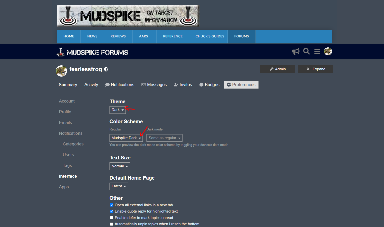
You can now pick a ‘color scheme’ to go with your theme. You should pick a ‘Dark’ Theme with a ‘Dark’ Color Scheme. Here’s an example using ‘Graceful’ as a green ish scheme:
If anyone has an artistic bent (I’m useless to the point of having negative talent) then feel free to go try some out here: https://theme-creator.discourse.org/
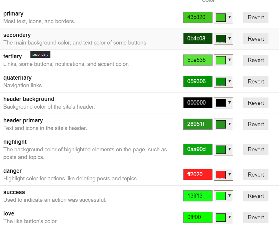
It has a color scheme editor with a live forum preview, and I’m happy to import anything. The numbers we’d need would be something like these:
Only thing I might add is to make note of your current Interface before making any changes so it is easy to revert back to your original style if you do not like any of the the other currently available options. Ask me how I know…
I’m currently rocking ‘Mudspike Dark’ which I added by taking the main site colors. Pretty mellow and avoids that ‘Teenage Blacklight Mood’ of too dark.
I updated it, but do use the Preview feature at https://theme-creator.discourse.org/ as that will allow you to see it in action and fiddle around with it until perfect.
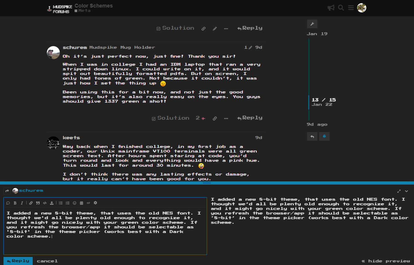
Oh it’s just perfect now, just fine! Thank you sir!
When I was in college I had an IBM laptop that ran a very stripped down linux. I could write on it, and it would spit out beautifully formatted pdfs. But on screen, I only had tones of green. Not because it couldn’t, it was just how I set the thing up
Been using this for a bit now, and not just the good memories, but it’s also really easy on the eyes. You guys should give 1337 green a shot!
Way back when I finished college, in my first job as a coder, our Unix mainframe VT100 terminals were all green screen text. After hours spent staring at code, you’d turn round and look and everything would have a pink hue. This would last for around 30 minutes.
I don’t think there was any lasting effects or damage, but it really can’t have been good for you.
I added a new 8-bit theme, that uses the old NES font. I thought we’d all be plenty old enough to recognize it, and it might go nicely with your green color scheme. If you refresh the browser/app it should be selectable as ‘8-bit’ in the theme picker (works best with a Dark color scheme.