Hind is pretty fast, I bet it would do ok.
Hind probably has a faster rate of climb, too.
1 Like
I’ve tried to recreate this in DCS and AI ignoring me completely.
im not sure… the I-16 got a pretty good beat down last time lol
2 Likes
Against a CE2 it oughta do ok.
2 Likes
Challenge Accepted!!!
https://www.youtube.com/watch?v=1NSb-YttCgU&feature=youtu.be&t=35m57s
a different program to the one above… some interesting stuff.
2 Likes


Oh No! My wallet cant stand it! Thanks for sharing brother.
2 Likes
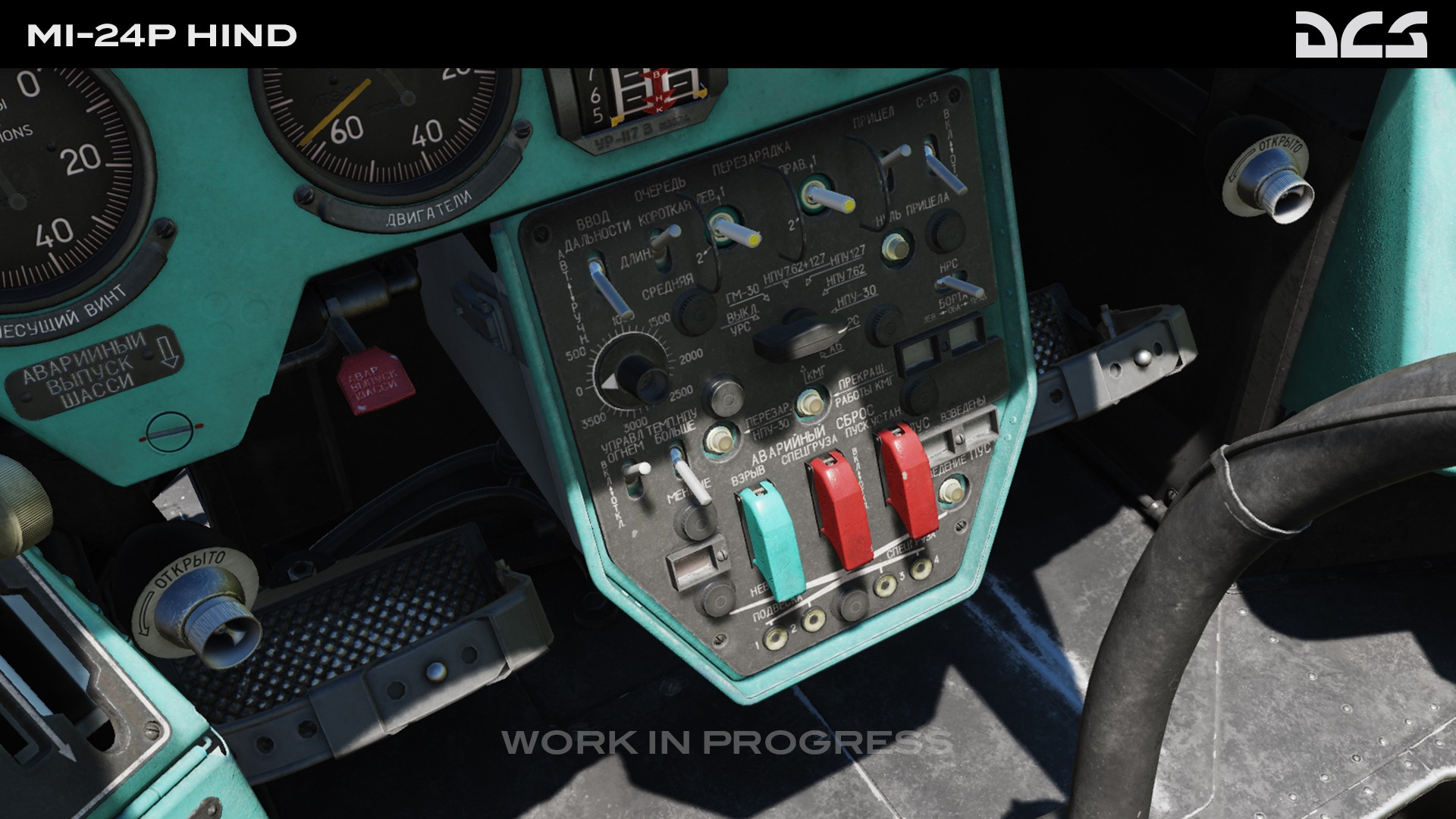
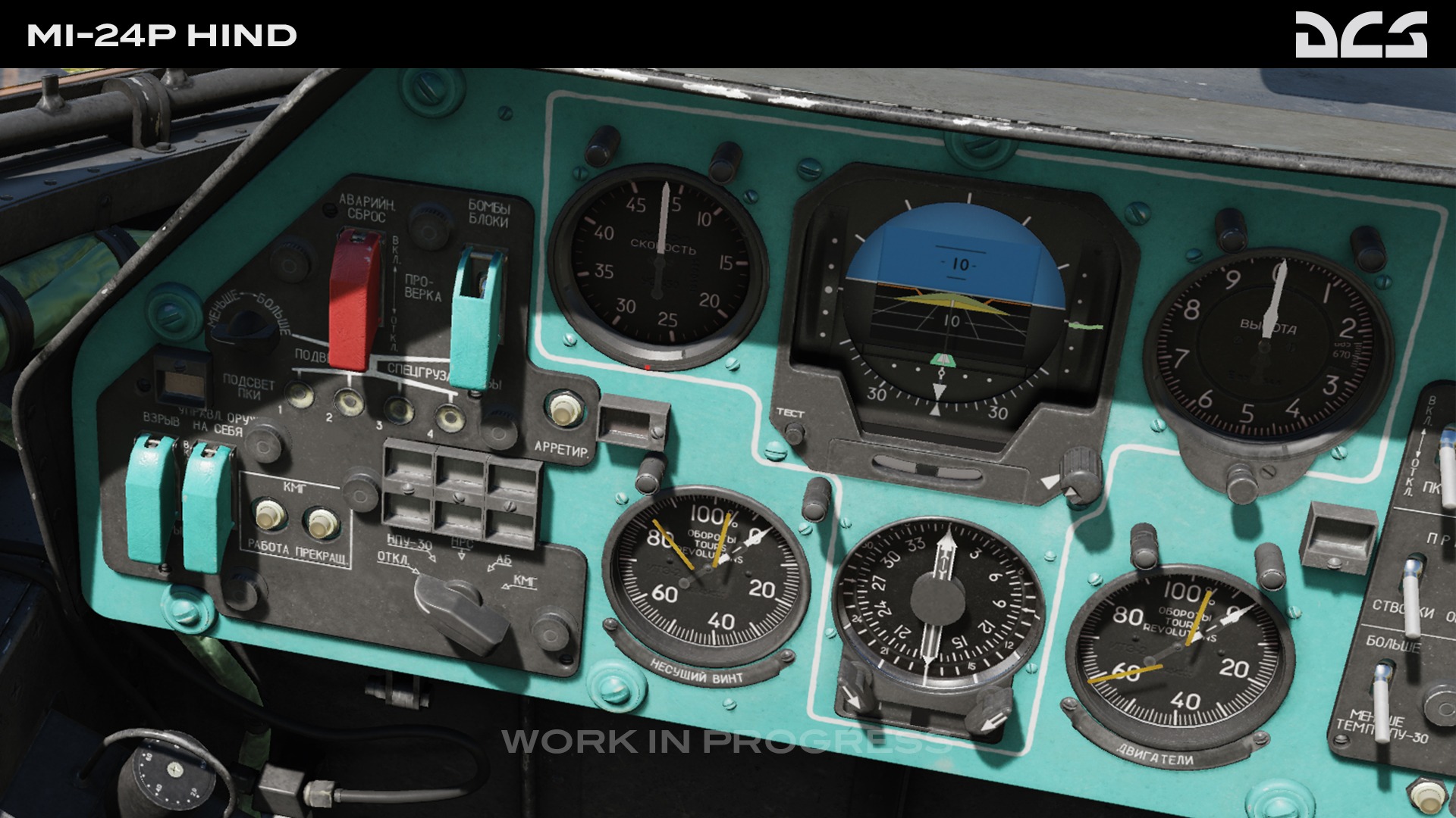
Anyone else suprised that the Mi-24 seems to be the only Soviet aircraft with a western style ADI?
2 Likes
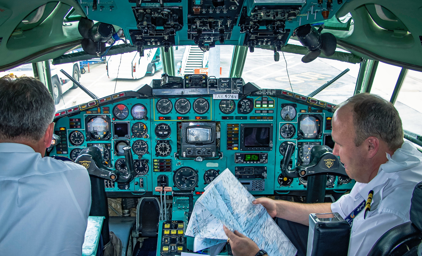
I have an odd fascination with cockpit color. (I know, who doesn’t?!)
My current plane is slate grey. Before that, even though it was also Boeing, the cockpit was completely different, using two shades of beige. The Airbus was blue with a hint of grey. I am sure that a lot of thought goes into color but what the overriding goal is I haven’t a clue.
This is all just to say that the Russian use of blue or turquoise is the best. It makes instruments and switches pop. The Ka50 would have benefited from going the same route I believe. Maybe the black panel worked better with NVGs? Well anyway the Russian blue looks strange the first time you see it. But it works. And it is eons better than Boeing brown.
5 Likes
It was my understanding that turquoise was selected after a study that suggested it helped lower the stress levels of the pilot in a busy environment. Personally I think it looks rather ugly and much prefer slate grey, although that is probably just because I am used to it.
7 Likes
Have to agree with this - you can definitely differentiate between instruments and panels when there is such an obvious border between them. Should be useful when talking someone through a startup over comms in MP.
I can see this as well, forgoing the contrast means things look uniform which could also mean less busy - less “individual” pieces of information and more “one big picture”.
2 Likes
I have heard that too. Green is supposed to relax your vision.
1 Like
This might reflect how you and I fly. Despite our best efforts we mostly have our heads buried inside. The Russian planes we are pretending to fly were designed for heads that are constantly switching focus inside and out. Thousands of such eye adjustments over the course of a day take a toll on fatigue and attention. It’s conceivable that the designers figured a lighter panel might help.
2 Likes
Ah… so they chose a color so repellent that you become inclined to spend more time looking outside the cockpit! ![]()
Seriously though, I’m sure that a lot of study went into choosing that color, and the Soviet design bureaus all adopted it…even for airliners.
7 Likes
Its happening!!! Soon!!! I’m very excited, it looks beautiful.
I would paint my house in that turquoise colour if I was single (and intended to remain that way i suppose)
Can’t wait to fly this beasty
7 Likes

Why not try it out on the inside of your truck? ![]()
7 Likes